
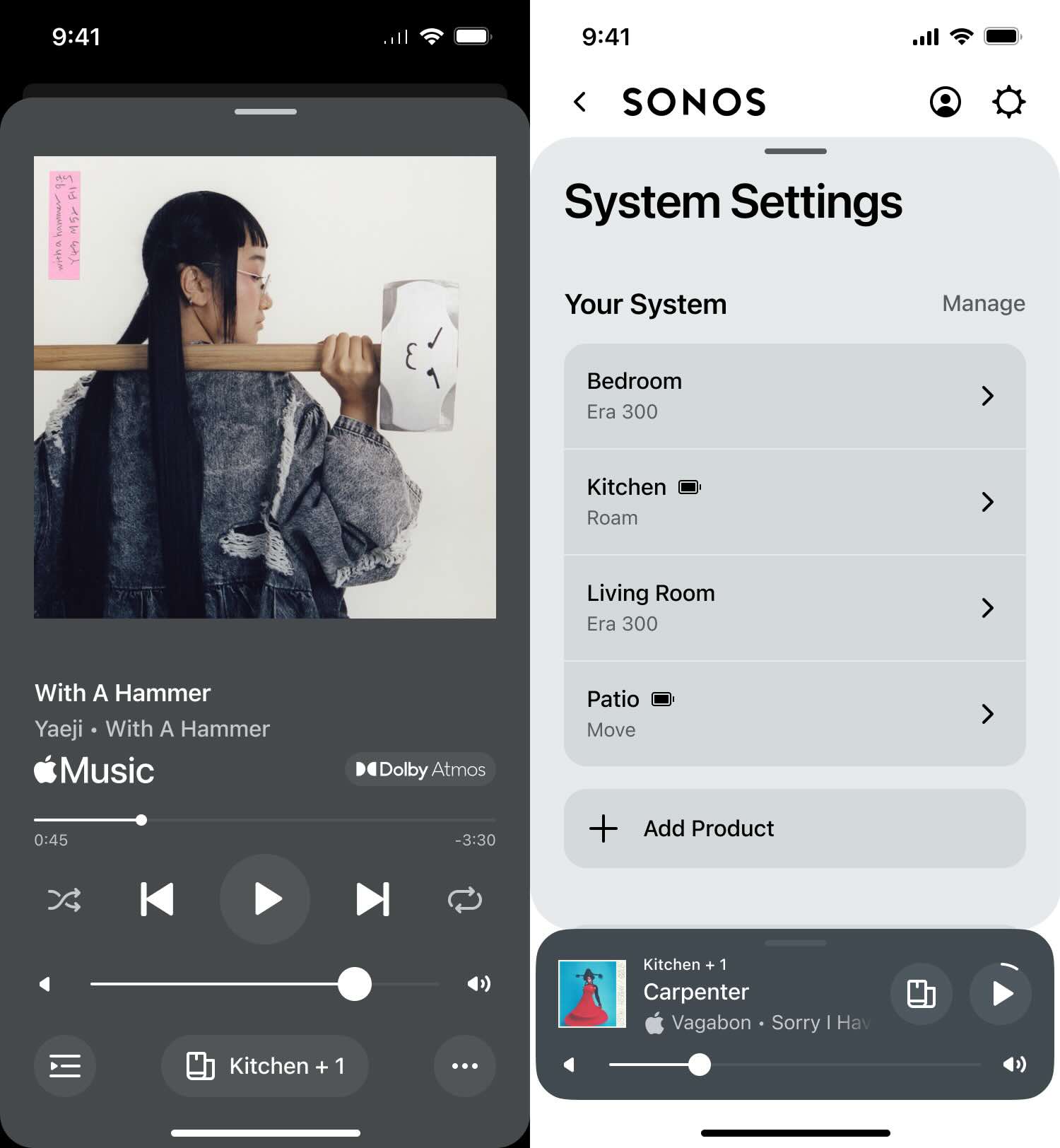
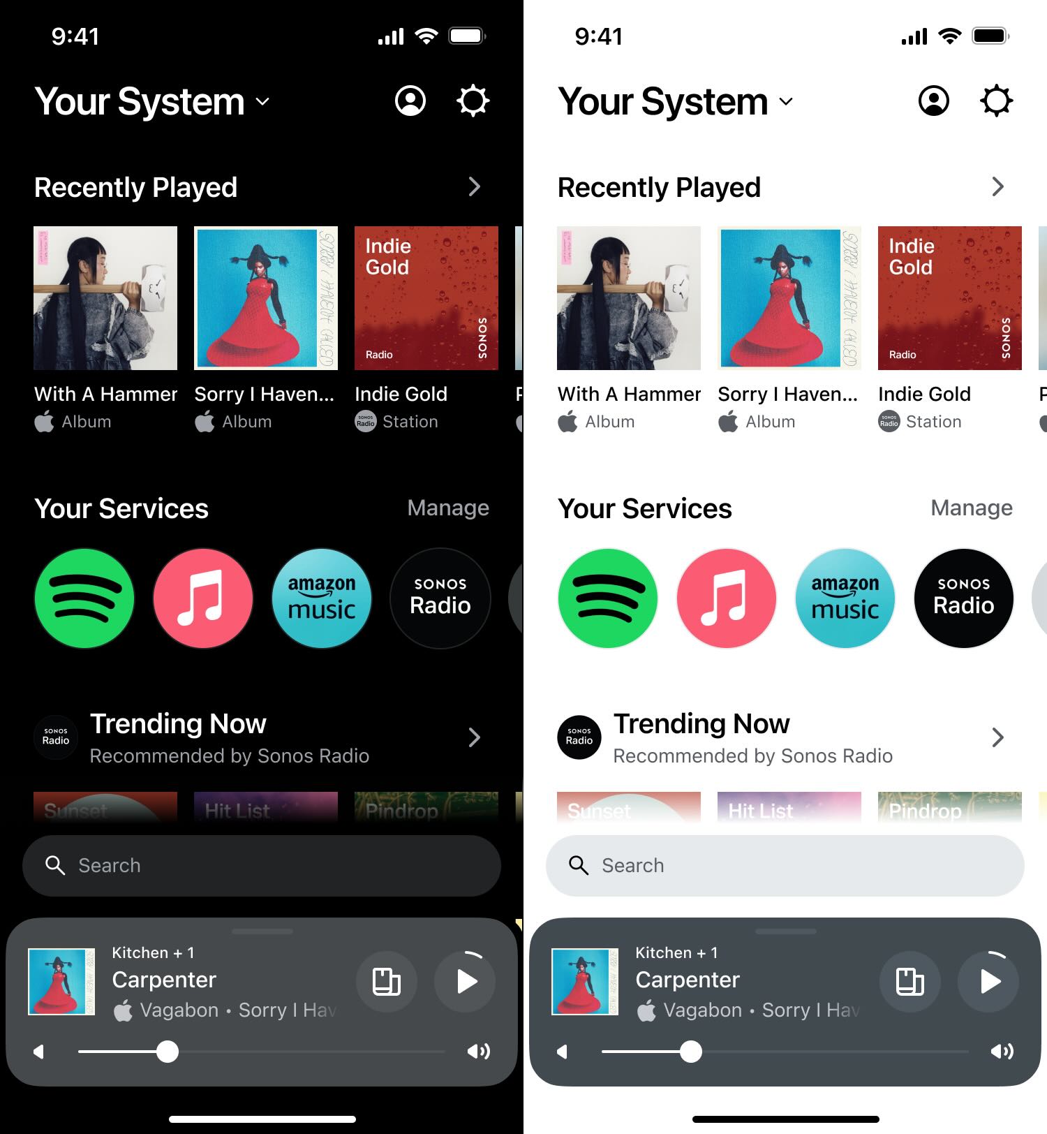
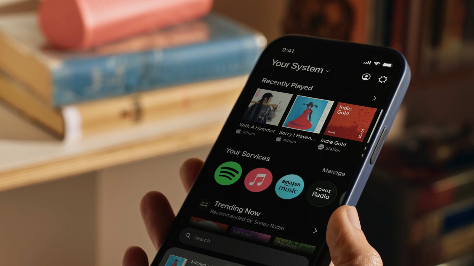
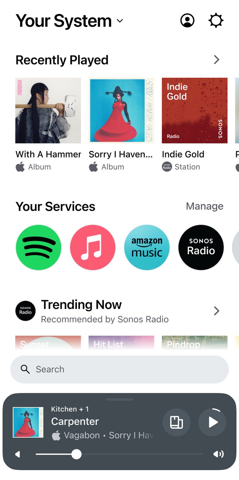
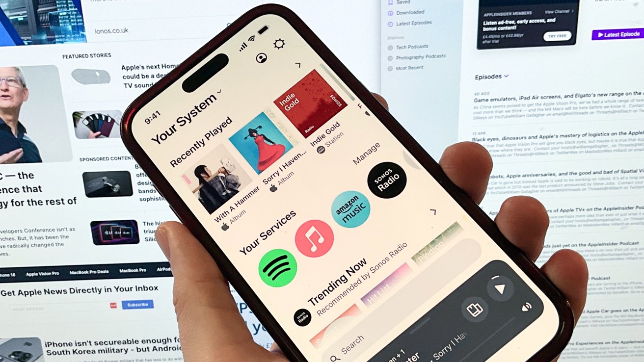
Sonos, a leading audio technology company, has recently unveiled an extensive app redesign for its users. The new app experience is available on iOS and Android platforms, as well as the web version. This overhauled design aims to streamline the user experience by eliminating tabs and bringing all content to one place: the Home screen.
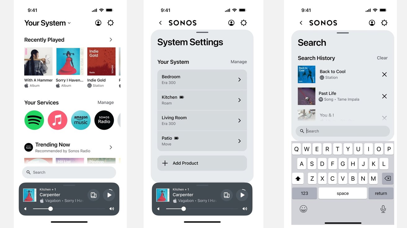
The new Sonos Home screen is faster and customizable, allowing users to bring their favorite content front and center. It features a search bar that enables users to look for an artist, song, podcast, or audiobook across all preferred streaming apps at once. This feature saves time by eliminating the need to switch between different apps.
The redesigned Sonos app prioritizes a human-centered listening experience and allows users to curate their favorite sounds in one place. The new Home screen serves up all favorite content and controls, all in one place. Users can customize the UI to fit their needs by designing their Home screen.
Swipe up from the bottom of the Home screen to access system control and get a visual overview of what's playing on each product. This feature provides easy access to essential information and allows users to make adjustments as needed.
The new Sonos app is set to launch on May 7, 2024. The web version will replace the existing Sonos desktop controller for all users.
Sonos's goal with this redesign was to make everything feel faster and get users where they want to be without relying on a tabbed navigation bar. By bringing all content to one screen, the new design aims to save time and provide a more enjoyable listening experience.
Sources suggest that Sonos is also working on new products, including a high-end amp codenamed 'Lasso,' a soundbar, and a subwoofer. These products are rumored to launch in late 2024 and 2025.
:format(webp)/cdn.vox-cdn.com/uploads/chorus_asset/file/25413644/webapp.jpg)
:format(webp)/cdn.vox-cdn.com/uploads/chorus_asset/file/25413642/sonosapp.jpg)
/cdn.vox-cdn.com/uploads/chorus_asset/file/25413635/Sonos_App_Redesign___Roam.jpg)